In my last post, I explored the CSS property transform-origin and in the last example, the rotate3d() property was also used to transform the DOM element. As I stated in the post, I wasn’t altogether confident that I understood the settings for the 3d rotation that rotate3d provided. So, in this post, I am going to take a harder look at rotate3d() and see if I can explain it. Again, I am using the help of the MDN Web Docs site to assist me and as a model for my post.
Rotate3d() Property Demo
1
2
3
4
6
Current settings: x-Vector: 2, y-Vector: 2, z-Vector: 1, Angle: -33 deg
The rotate3d() property deals with 3D space (x, y, and z) like the transform-origin property. However, the transform-origin is about establishing a single point in 3D space, while the rotate3d property is about the movement of an element in the direction of three vectors (x, y, and z) as well as at a defined angle (a) in three-dimensional space.
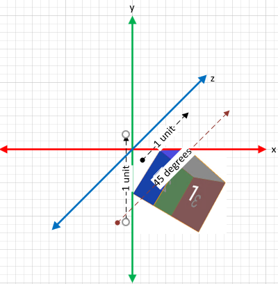
What the hell does that mean? Well, let’s look at a few simple examples. In each of the examples below the angle is set to 45 degrees on each rotation. The only change between them is the vector that is applied.
Single Value Rotations

x-Vector Example:
.target {transform: rotate3d(1, 0, 0, 45deg);}
In this example, the rotation vector is on the x-axis. This causes the rotation to occur along the horizontal x-axis and the positive angle of 45 degrees causes the rotation to go upwards.

y-Vector Example
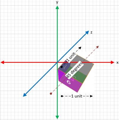
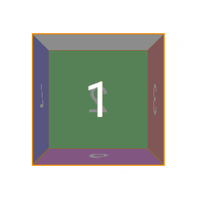
.target {transform: rotate3d(0, 1, 0, 45deg);}
This second example produces a rotation on the vertical y-axis. The rotation is to the right along the y-axis at 45 degrees. If the angle is changed to a negative value the rotation would still be around the y-axis it would just rotate to the left.

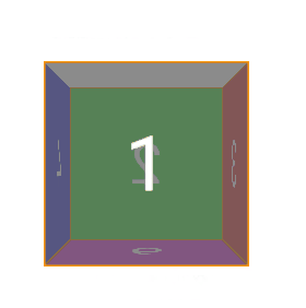
z-Vector Example
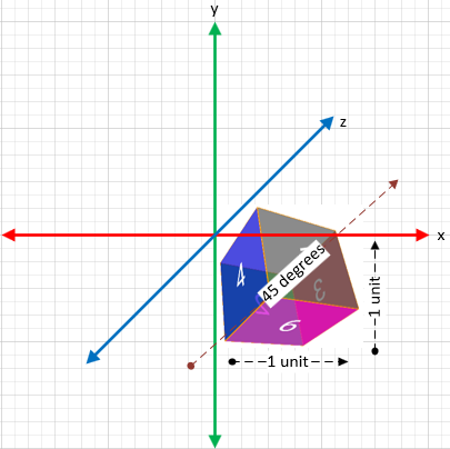
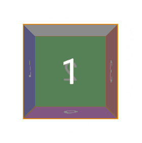
.target {transform: rotate3d(0, 0, 1, 45deg);}
And now in this example, the rotation occurs around the z-axis. The z-axis is a little harder to visualize, but imagine an arrow pointing directly at you that is going through the cube. The point of the arrow comes out through the cube where the number 1 is on the cube face. The cube is rotating around that arrow, Again, because the angle is a positive value it rotates to the right.
It is important to remember that the default origin property is still at work. All of these DOM objects have a default origin of (50%, 50%, 0) for the x, y, and z values. To add even more dramatic changes to the rotations we could add a transform-origin property to the cube to change the point where the rotation occurs. But that will be another post.
Let’s look at three multiple value rotations.
Multiple Value Rotations

x-y-Vector Example
.target {transform: rotate3d(1, 1, 0, 45deg);}
x-z-Vector Example
.target {transform: rotate3d(1, 0, 1, 45deg);}
y-z-Vector Example
.target {transform: rotate3d(0, 1, 1, 45deg);}
Normalizing Vectors
In the examples above I used the number 1 for the x, y, and z values for simplicity. But in fact, you can input any number for the vector values, This is because the user agent will normalize the vector. A normalized vector is one where the sum of the square of its three coordinates is 1. If this is not the case then the user agent will do the following math to convert the numbers that are input into a normalized vector. In the example below, I entered 3, 2, and 1 for the x, y, and z values. This is obviously not a normalized vector. Then I show the math that is done to normalize it. The two gifs show my original input (3,2,1) and the normalized version (0.802, 0.534, 0.267) and the cube rotates along the same vector.
.target {transform: rotate3d(3, 2, 1, 45deg);}
length = sqrt(x^2 + y^2 + z^2)

normalized vector = (x/length, y/length, z/length)

solution:

length = sqrt(3^2 + 2^2 + 1^2) = 3.742

normalized vector = (3/3.742, 2/3.742, 1/3.742) = (0.802, 0.534, 0.267)

Non-normalized Vector
.target {transform: rotate3d(3, 2, 1, 45deg);}
This first example shows the rotation of my original inputs of 3, 2, and 1. This vector is not normalized. But look at the second example below where I input the normalized values and the result.
Normalized Vector
.target {transform: rotate3d(0.802, 0.534, 0.267, 45deg);}
The normalized vector produces the same rotation. This shows that the user agent is doing the math to normalize the input in my 3, 2, 1 example above prior to producing the rotation.
One thought on “Rotate3d() CSS Property”