The CSS property ‘transform-origin’ is a little bit of an enigma for me. Like most people, I don’t use it very often, so I forget how it can be useful when manipulating items such as animating a DOM element.
In this post, I want to reinforce the transform-origin properties usage. I also will touch a little on animations, transforms, and transitions while walking through this concept. I created this post simply to make this property more memorable for me but hopefully, it will be beneficial for you too.
So, full disclosure, to take on this project I used riffed on the ideas found here on the MDN Web Docs site. This page helped me understand the concept, but to help me memorize the concepts, I decided to make my version with my code.
Transform-Origin Property Demo
Default Origin
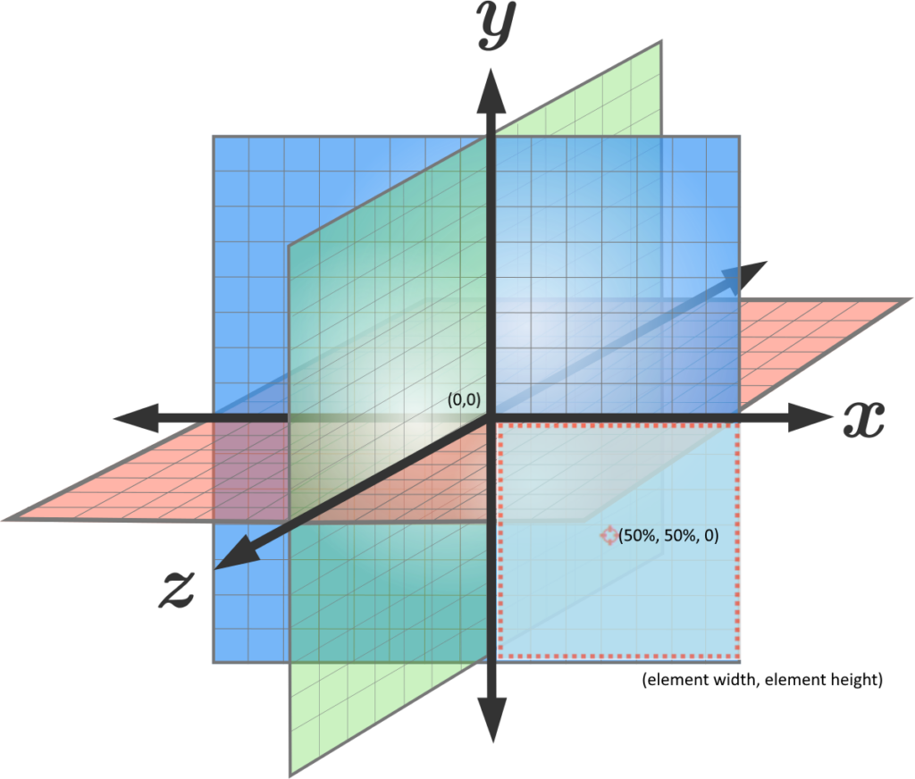
Ok, the first concept when it comes to transform-origin is understanding where on a DOM element is the origin of the element. The default origin for any DOM element is in the center. Thus, when you apply a transformation to an element such as rotate, it will be applied to the center of the element. But wait, what is the center? The origin of a DOM element has three coordinate values 1) x-offset, 2) y-offset, and 3) z-offset. The image below helps to picture what this three-dimensional coordinate system looks like. I have overlayed the square element from the transform-origin demo above onto the coordinate system to provide more context. The default center of the element is 50% of the width, 50% of the height. These are the x-offset and y-offset values. In addition, there is a third coordinate for the z-offset, which created the third dimension. The z-offset value is set to zero by default. This is the example of the first button in the demo labeled ‘center’. The transform property ‘rotate’ is applied and the DOM element (square) rotates around the center where the origin is located by default.
Changing (transforming) the Origin
Now, that we know where the default origin is for the DOM element let’s try our hand at changing it. The first change in the demo above is to move the origin to the top left. This is equivalent to (0,0) in the coordinate plane. When the second button labeled ‘top left’ is clicked the class below is applied, which moves the origin of the element to (0,0) and that is where the rotation happens.
.top-left {
  transform-origin: top left;
}
A Note About Syntax
The transform-origin property can take the following syntax inputs:
/* One-value (Single values of length or percentages are horizontal values. */
transform-origin: 25px;
transform-origin: top;

/* x-offset | y-offset */
transform-origin: 10cm 14px;

/* x-offset-keyword | y-offset */
transform-origin: right 10px;

/* x-offset-keyword | y-offset-keyword */
transform-origin: right bottom;

/* y-offset-keyword | x-offset-keyword */
transform-origin: bottom right;

/* x-offset | y-offset | z-offset */
transform-origin:  5px 22% 45px;

/* x-offset-keyword | y-offset | z-offset */
transform-origin:  right 18px -25px;

/* x-offset-keyword | y-offset-keyword | z-offset */
transform-origin:  left top 5cm;

/* y-offset-keyword | x-offset-keyword | z-offset */
transform-origin:  bottom right 22px;
The keywords for x-offset are left, right, and center. The keywords for y-offset are top, bottom, and center. There are no keywords for the z-offset. There is a critical relationship between the keyword syntax and percentages.
| Keywords | Value |
|---|---|
| left | 0% |
| center | 50% |
| right | 100% |
| top | 0% |
| bottom | 100% |
In the demo above the button labeled 50px 50px moves the origin from right along the x-offset by 50px and the y-offset down by 50px from the point of (0,0) as the starting point. This is an important point because it can be confusing and sometimes you might think that it should move 50px right and 50 px down from the default origin. That is not the case. The transform always starts from the upper left (0,0) point. Here I applied the following class to transform the origin.
.fifty-fifty {
  transform-origin: 50px 50px;
}
3D Transform
Alright, we have two dimensions in hand but how about three dimensions? Well, let’s look at the last and most complicated example in the demo.
.three-d-rotate {
  transform-origin: bottom right 60px;
}
When the above class is applied to the element by clicking on the ‘Bottom Right 60px’ button. The origin is transformed to the bottom right corner. But it is also moved backward from the viewer’s point of view along the depth of a third dimension. This is what causes the rotation to rotate from a point further back.
Additional Information
In the CSS for this project, I also used animation effects to make the rotation of the element smooth. For the standard (non-3D) rotation the keyframe was straightforward. However, the button ‘Bottom Right 60px’ is a little more complex. First, there is the transform-origin, which in this case takes three values, the x-offset, y-offset, and the z-offset. So, it is in the bottom right and set back from the viewer by 60px. Then there is the rotation animation.
@keyframes rotate3d {
  0% {
    transform: rotate3d(0);
  }
  100% {
    transform: rotate3d(1, 2, 0, 60deg);
  }
}
For a 3D rotation, there are four values: x, y, z, and angle (a). As explained by the MDN:
The amount of rotation created by rotate3d() is specified by three <numbers>s and one <angle>. The <number>s represent the x-, y-, and z-coordinates of the vector denoting the axis of rotation. The represents the angle of rotation; if positive, the movement will be clockwise; if negative, it will be counter-clockwise.
https://developer.mozilla.org/en-US/docs/Web/CSS/transform-function/rotate3d()
I still haven’t completely wrapped my head around this. So, I will use this as a future post to see if I can better understand the relationship between the 4 inputs. More to come on this.
After recreating the MDN for transform-origin, I have a better understanding of this very useful property. Thank you, and I hope this has been informative for you too.
**Update: Post on rotate3d() property.
2 thoughts on “Transform-Origin CSS Property”